As evidenced by our blog’s whiteboard background, deliberations over the design of Foothill’s masthead and logo were lively. To our credit and my (pleasant) surprise, while everyone expressed strong opinions, proceedings remained civil.
The whiteboard brainstorm was especially amusing. Like its name, we hoped the journal’s design would somehow echo its concept (a publication for poets who are laboring toward the far off pinnacle of their careers). Moreover, we realized that for some mysterious reason the word foothill reads foo-thill when written in certain fonts. For at least an hour and a half we anxiously and creatively explored ways to set off the two syllables from each other while retaining design integrity. The entire effort was almost crippled by Jordan’s hilarious pictograph of a foot beside what I presume to be an anthill (bottom right of background photo).
I later approached our graphic designer Shari Fournier-Oleary with a headfull of vague and half-baked ideas that she magically made design sense out of. She gave us over twenty options, which resulted in yet another multi-hour discussion at our next meeting. Fingernails were bitten, brows furrowed, opinions advanced and retreated, drinks were drunk, and the white board was again left splattered with absurd graffiti. But decisions were made.
And after a few minor tweaks submitted to Shari, we had a masthead and logo (below).

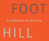
What drew us to this masthead is that there is an expansive, almost lonely quality to the emaciated letters fleeing each other across the line. As you may know, the Foothill Avenue that runs along the north border of CGU’s campus is the final stretch of Route 66, a highway that encounters landscapes we felt were echoed in the ambiance of the design without being distastefully literal.
In the logo, this same spirit is preserved along with a kind of playful Modernist e.e. cummings/Charles Olson/Robert Duncan word/line break.
And yes, the design references the journal’s concept not very much. This is probably for the best.
I don’t know that anyone one of us editors got everything we wanted in the deliberations and we were pained to jettison a lot of other great designs, but what we individually compromised compromised nothing in quality. Acclaim for this goes to the incredible work of Shari. And our mothers’ training in civility. And maybe too to the generous donation of several boxes of Dale Brothers 22oz. bottles we received from the Office of Advancement (left over from an alumni event I wish I’d been at).
Nice logo ,i am also searching good logo.Thanks for post this type of logo
ReplyDeleteThanks for all the great information I have found here. I see so much I can do with my blog now.custom logo design
ReplyDeleteIt is attractive, simple and meaningful logo and in my opinion every designer should try to make these kinds of simple, attractive but meaningful logos.
ReplyDeletecustom logo design
I Have seen a lot of Custom Logo Design and saw many logo contest design, but this logo is epic yet unique. The feel is so different and touches heart whenever I look this logo…
ReplyDeleteYour blog is very useful to all the people especially for Banner Designers. So much important information is there in your site and my site is
ReplyDeletealso having valuable information.
cheap logo designs
cheap logos
I like the idea of the logo design; Good job.
ReplyDeleteThanks for this interesting post, website design and logo design company in Australia are shining to bring positive change in your business thanks share it.
ReplyDeleteLogo Design Company
Really nice information i get from your article. I share your article on stumble as well. Keep Sharing nice posts
ReplyDeleteYour blog is very useful to all the people especially for logo Designers. So much important information is there in your site and my site is also having valuable information.
ReplyDeleteCheap logo design in Pakistan
Cheap logo design in Pakistan
Nice post.I am looking forward for new ones, keep up the great work.
ReplyDeleteCheap Logo Design
very nice post keep up :)
ReplyDeleteNice post! The Neon Factory offers business neon signs, custom neon sign, neon signs open etc of various color, size, shape and style. You can also get them in flashing animation which adds on attractiveness.
ReplyDeleteThe writer had completely described about the most finest quality logo design (Logo ontwerpen) services in which their company entirely specializes following the aim to provide the golden opportunity to opt for an exclusive design to set it as the enterprise's logo. So that, the narrator had also provide some of the knowledge about the same.
ReplyDeletelogo design NJ is the best idea.
ReplyDeleteThanks for updating us with this nice and relevant information as we are also working with Logo Desing. So this info. will be very helpful for me. Paisley Studios
ReplyDeleteYour thoughts are wonderful. Your blog is very useful to all the people especially looking for logo designing. Please keep posting...
ReplyDeleteVery Nice Post. I really appreciate with your blog.Thanks for sharing. Without a good logo design, it is impossible for any business to survive in competitive market.
ReplyDeleteSelecting a font for your logo is a vital decision. If you are using a text-only logo or a design, the look of your lettering can make or break the whole design.
ReplyDeletelogo design